

You are using an out of date browser. It may not display this or other websites correctly.
You should upgrade or use an alternative browser.
You should upgrade or use an alternative browser.
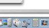
triangle not centered!
- Thread starter kanecorp
- Start date
We don't like Ads much either, but they do help cover the costs of running the site. Please consider turning off your ad blocker. Thank you.
evildan
Super Moderator
Well, not to contradict what you've said, but that technically seems like the center of the icon. If you look at the icon from the left-most to the right-most pixel, it is indeed centered.
Yes, according to the disk icon, it does look too far right, but if you consider the stethoscope, it does appear to be okay.
Yes, according to the disk icon, it does look too far right, but if you consider the stethoscope, it does appear to be okay.
Total Konfuzion
Registered
lol.....at first glance it does look like the icon isn't centered...i would have freaked out too dude ")
adambyte
Registered
Yeah. Icons that lack balance really bug the crap out of me. I'm a total interface nut, and that icon bugs me to no end. It completely lacks balance. Therefore, when you look at it in icon mode, or launch it, the name or triangle appears where the icon space is centered, but not where the vast majority of the icon actually is.
Let this be a lesson to all you icon designers.
Let this be a lesson to all you icon designers.
ElDiabloConCaca
U.S.D.A. Prime
Yes, I've noticed that Apple is trying to keep a semi-uniform design to their icons -- mostly square in shape, tilted slightly counterclockwise... as with iCal, Address Book, Mail, Safari (well, it's round, but uniform and tilted!), iPhoto, etc... it seems that Apple's utilities, or things that usually don't reside in the dock all that often, are a little less uniform in design... and don't even get me started on the developer tools icons! Those seem hacked together... like they needed placeholder icons until they could get some real ones, which they never did...